Embed widget
The Ducalis widget notifies users about new features and allows them to leave feedback directly in your product. Embed it to increase engagement with your Voting Board, Roadmap and Changelog.
It also helps collect feedback from users without interrupting their workflow.
Live demo: Visit https://hi.ducalis.io/ and click New in the header menu.
Embed anywhere
Embed the widget on any page where you want to collect feedback or show new features notifications.
At Ducalis, we embed the widget on:
- Marketing website: https://hi.ducalis.io/
- Help portal: /knowledge-base/
- Product: hi.ducalis.io
Set up the widget
If your Voting Board is private with access restrictions, you must pass user identities to the widget. Otherwise, no one can access it.
Open Voting Board settings
-
Go to Voting Board settings.
-
Find Embed section. Click on Feedback / Changelog / Roadmap widget.
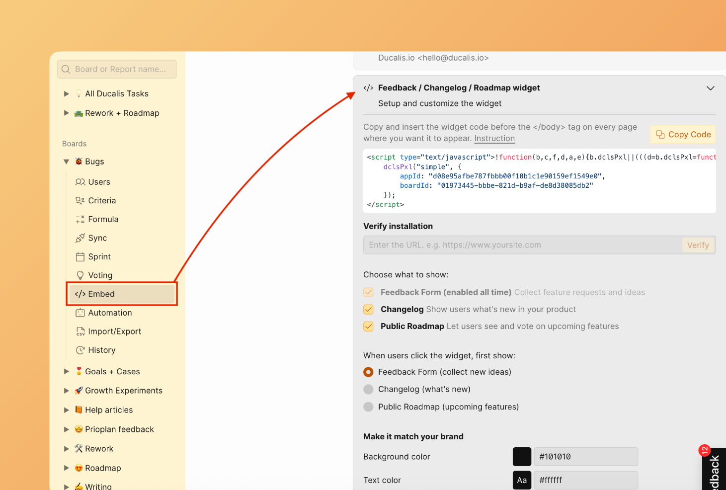
Install widget code
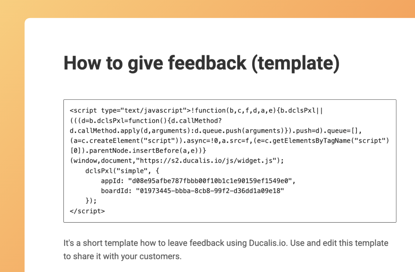
- Copy and paste the HTML code into your website, app, or any page where you want it to appear. Save changes.
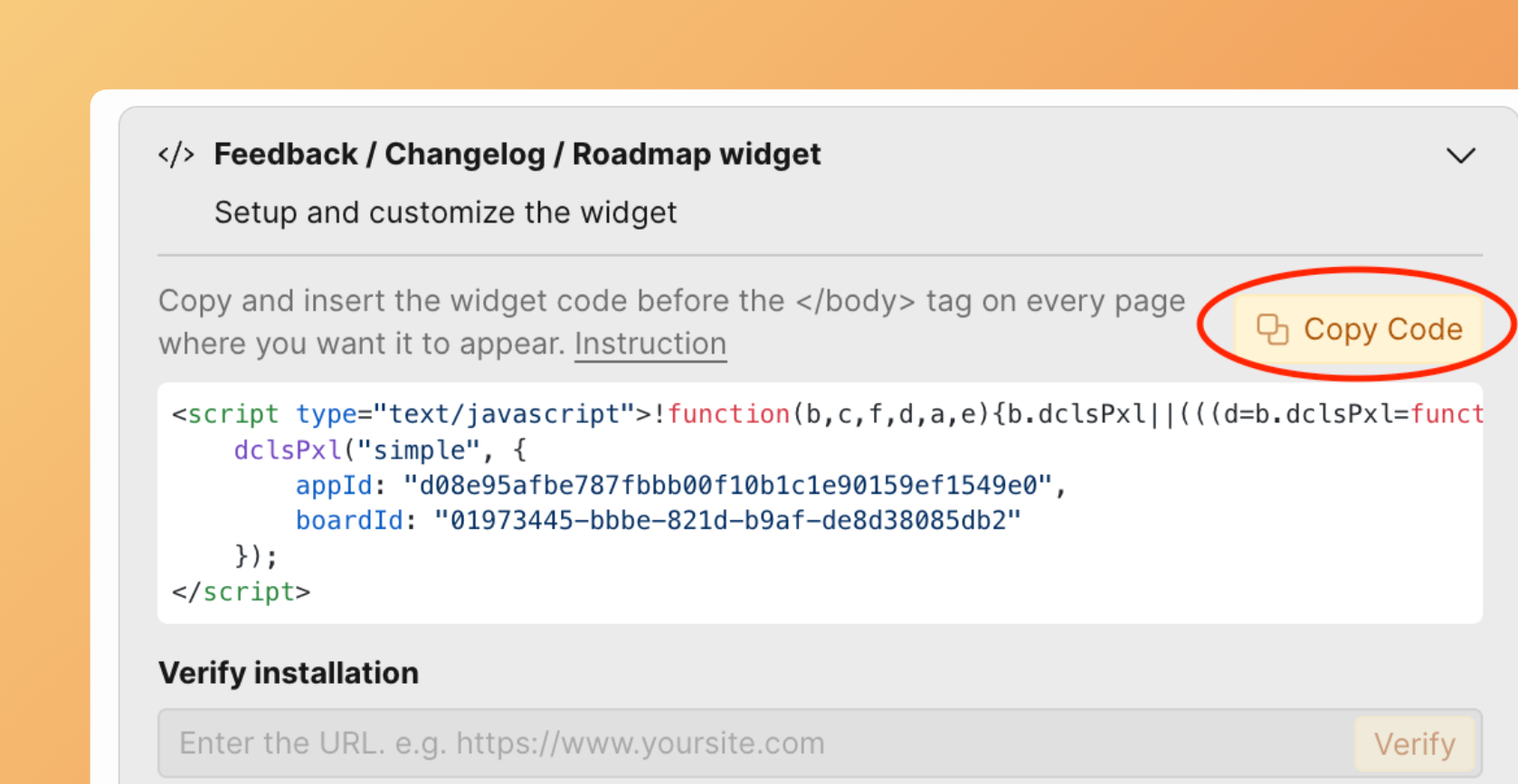
For example,
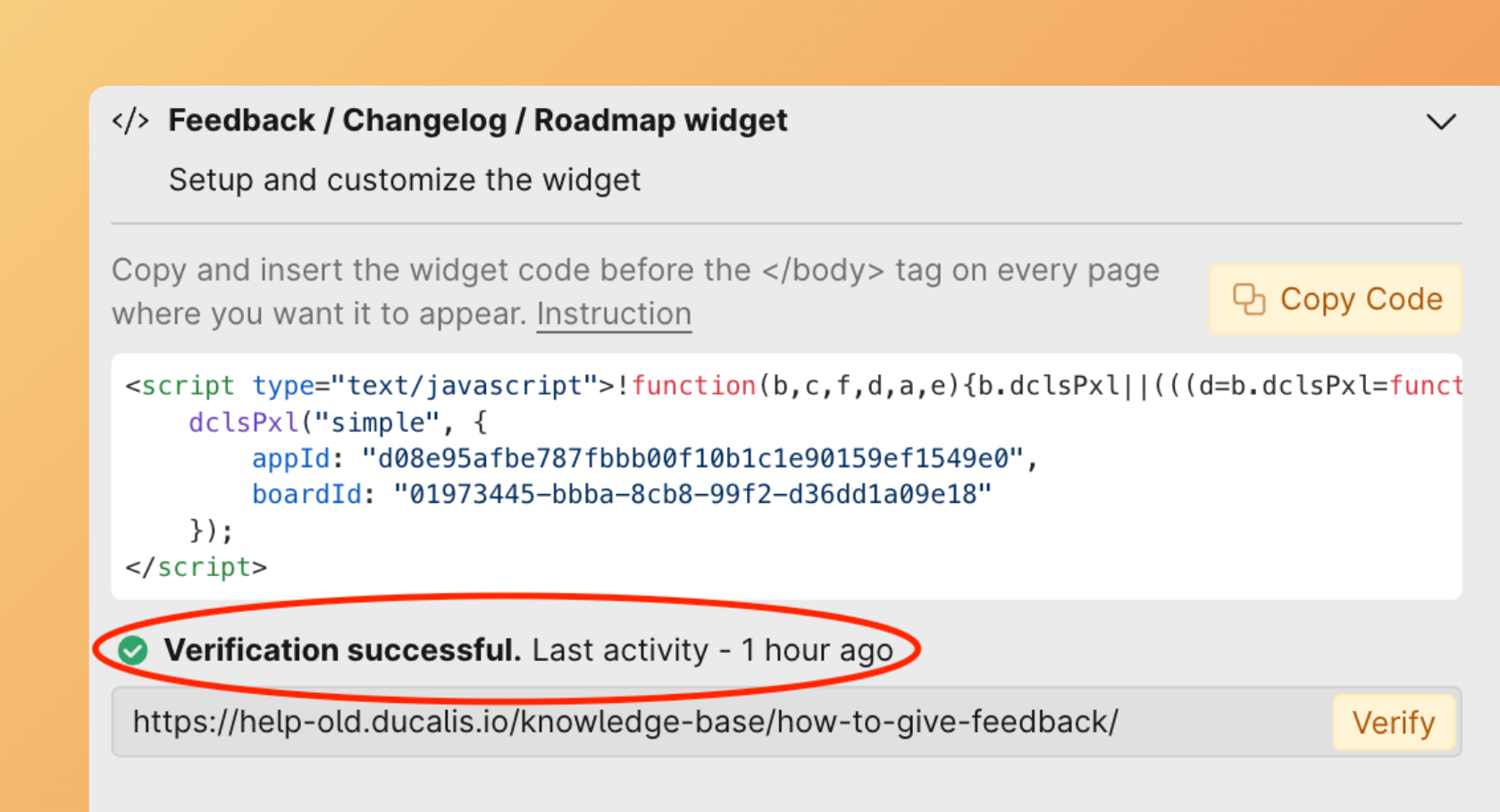
- Then click Verify.
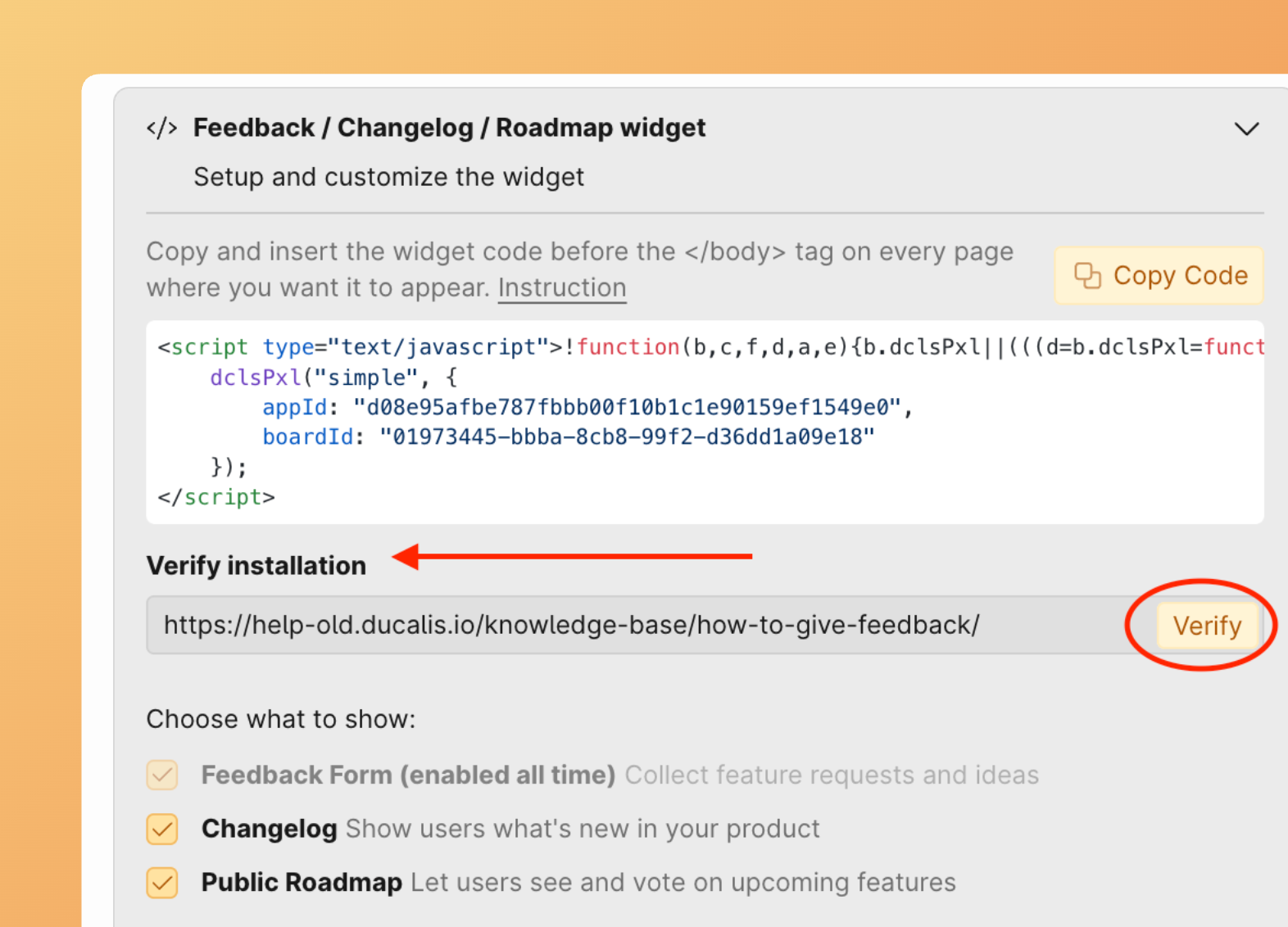
- A confirmation message will appear, showing the verification result.
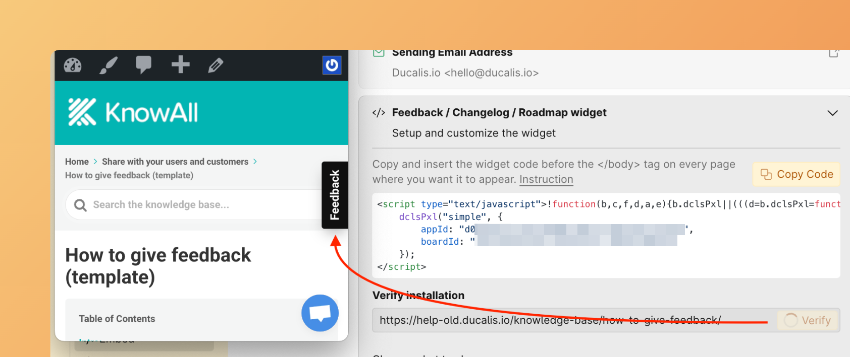
Installed widget example:

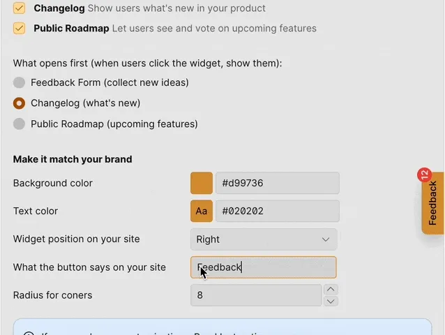
Choose Pages To Show
- Set up which sections you want to show when users open the widget.
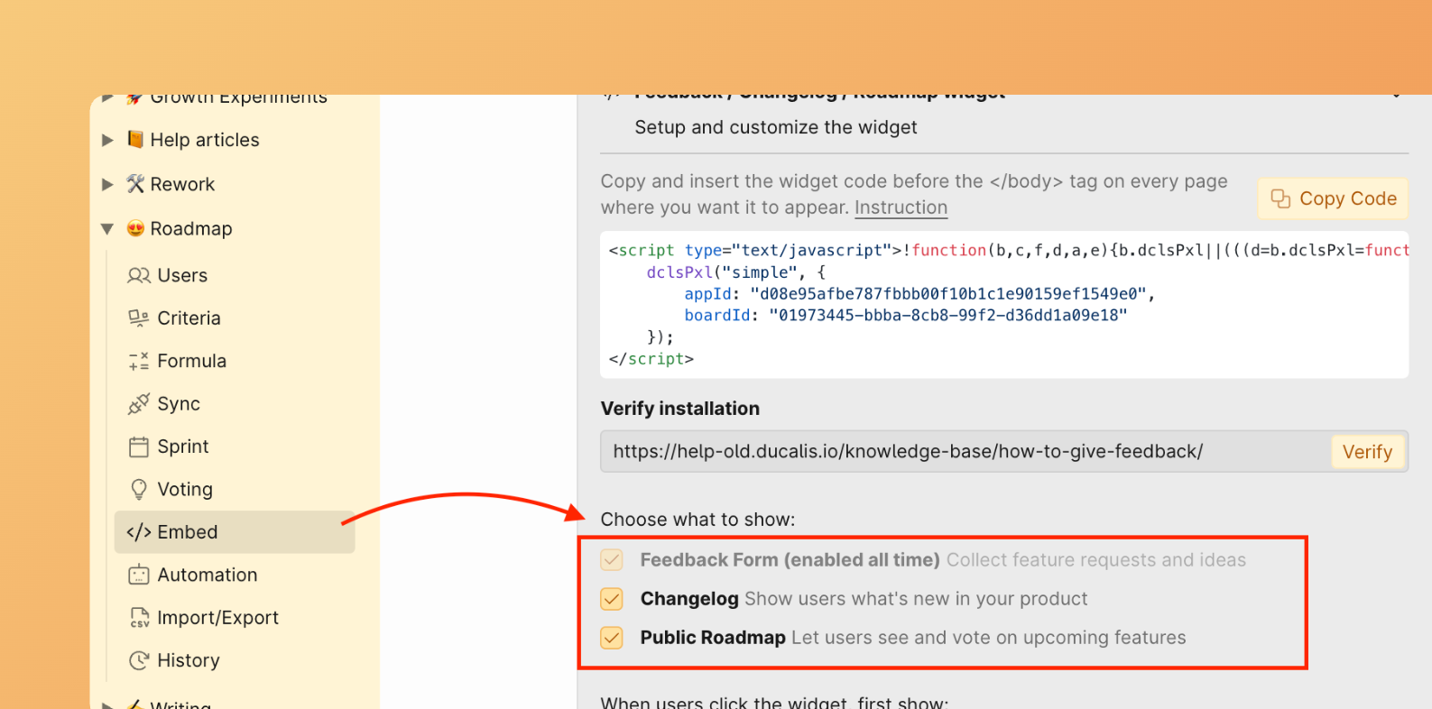
- Save changes to apply them.
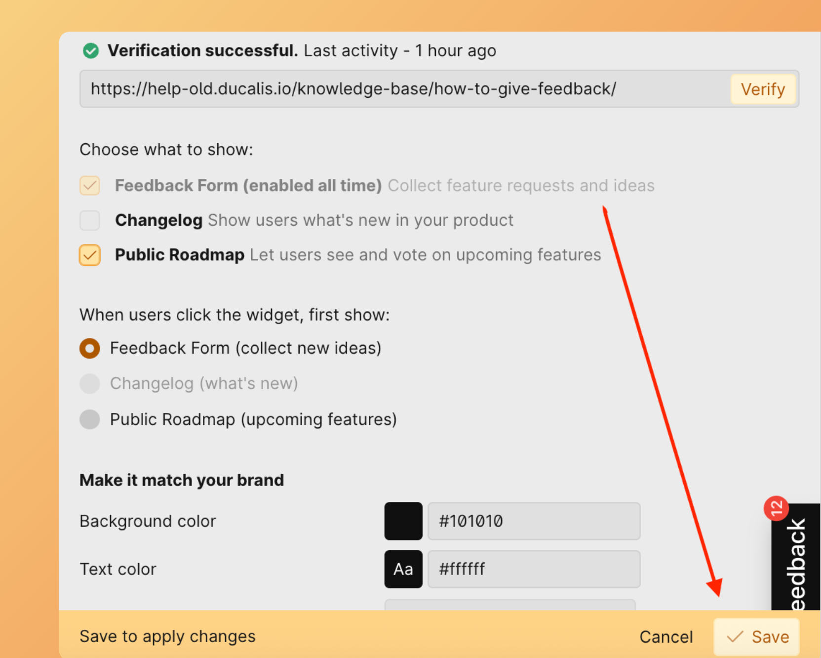
By default, the Feedback Form is always shown to give users the opportunity to leave feedback.
For example, if you choose Public Roadmap, the widget will show the Feedback Form and Roadmap sections, while the Changelog will not be shown.

Choose What to Open First
- Set up what to open first when users click the widget button.
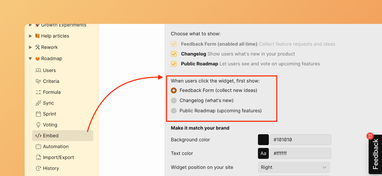
- Click Save to apply changes.
For example, if you choose Changelog, when a user clicks the widget, the changelog will open first.
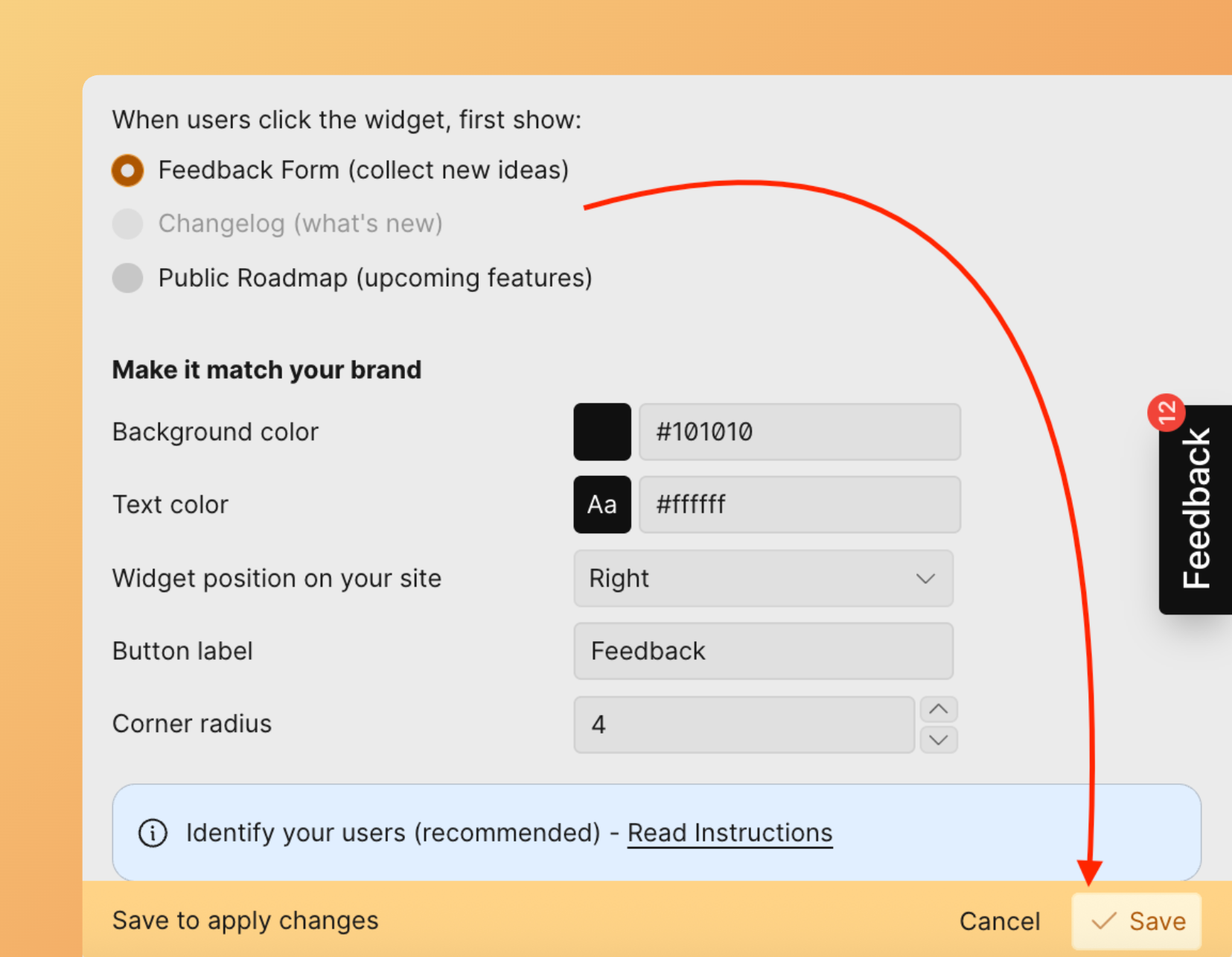
Customize Widget Appearance
Create a style theme for the widget — including background color, text color, widget placement, button label, and corner radius.
Background Color
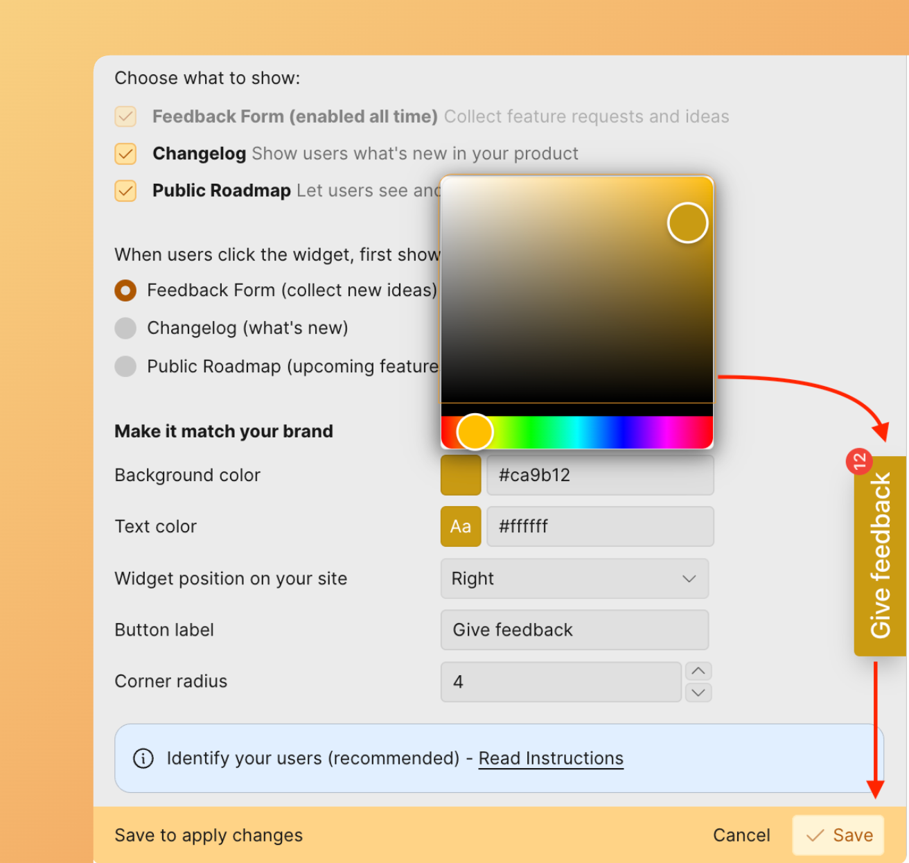
Text Color
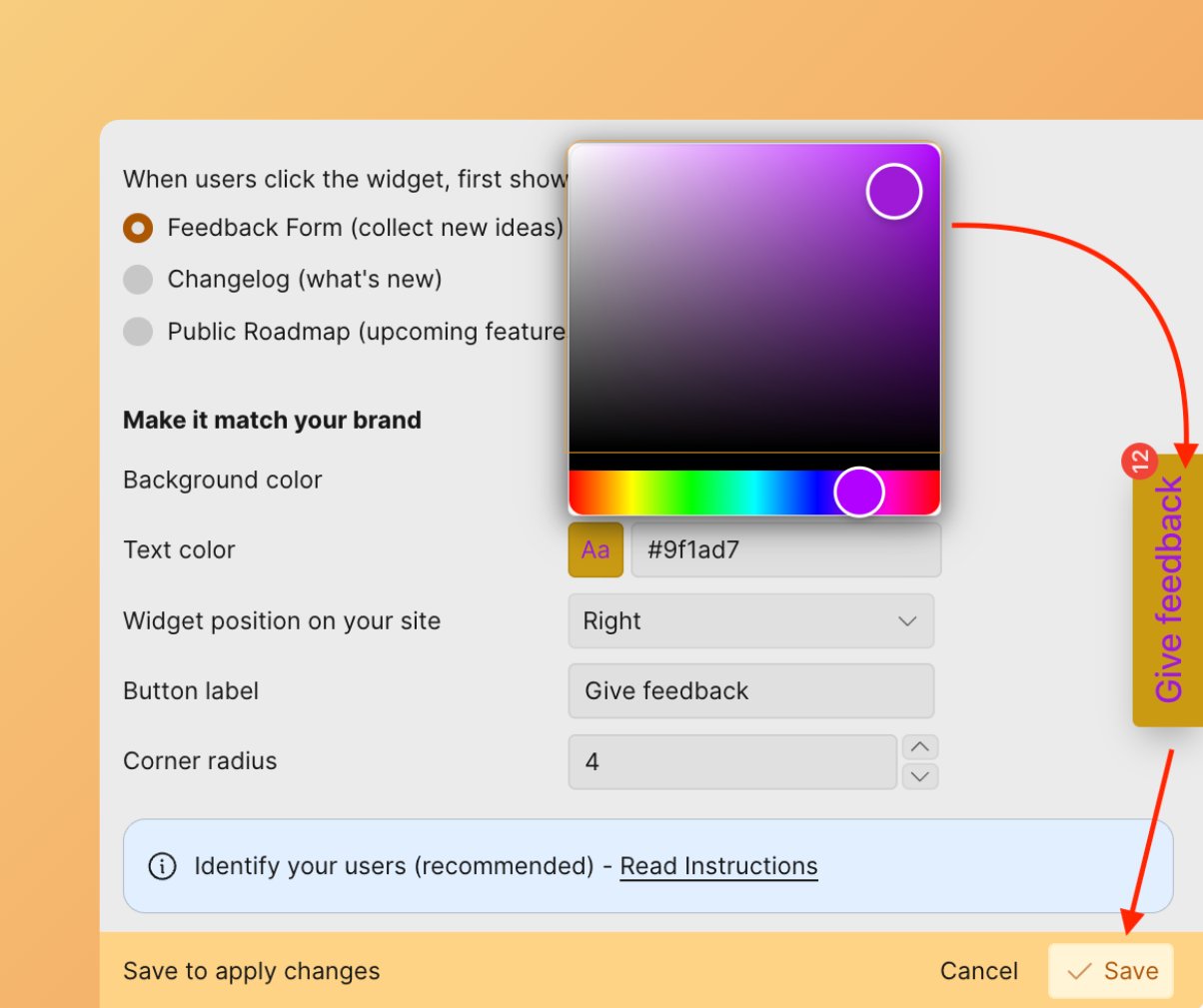
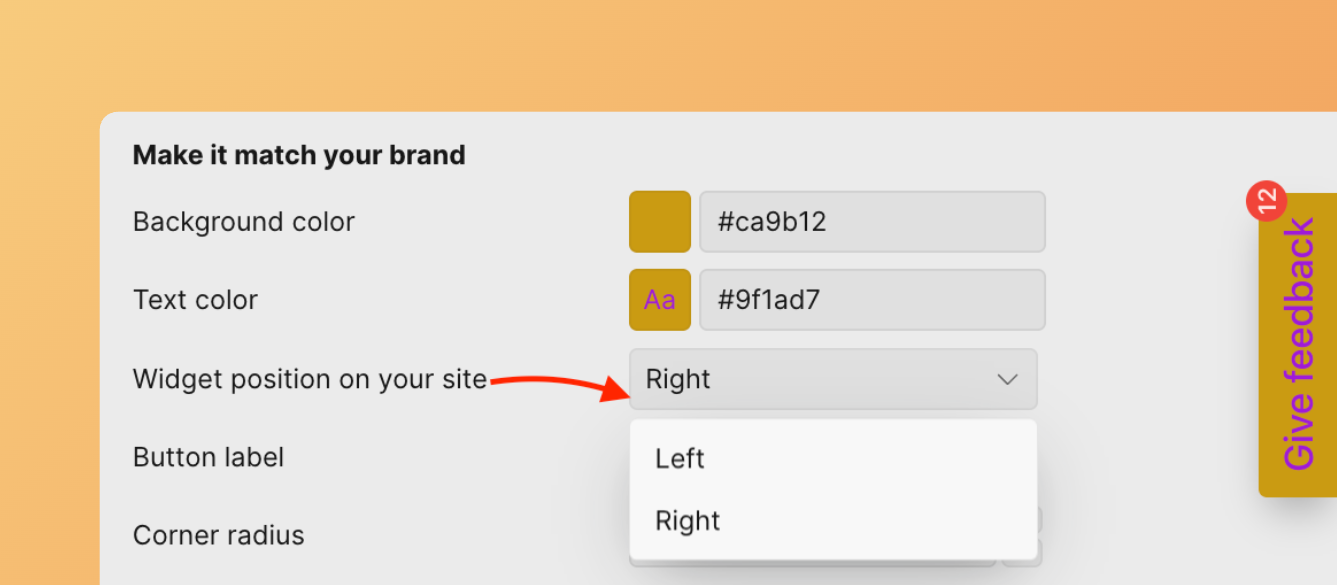
Placement
Button Label
Customize the text.
Widget features in base configuration
This base setup provides:
- Widget displays latest Ideas in Done status, sorted by release date on Changelog page
- Notification bubble for newly released features (Ideas moved to Done)
- Visitors can read up to 20 released Ideas
- Link to Voting Board to check roadmap, add Ideas, upvote, and comment
- Email capture for roadmap weekly digest updates
Identify Your Users
Choose between Ducalis authentication or your own authentication method.
Option 1: Use Ducalis authentication (default)
By default, Ducalis authentication is used when customers want to vote, add Ideas, or comment.
Option 2: Use your own authentication
If you use your own authentication, specify it in code: onAuth: showUserAuth
When this function is specified, it replaces Ducalis authentication. You handle the entire authentication process, but you must pass the authenticated widget user: user.email + user.hash are required.