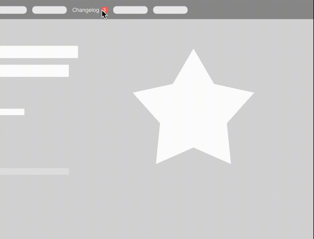
With the Ducalis Widget, you can significantly increase your users’ engagement in your voting board in two ways.
🚨 Changelog widget and notifications
After embedding the widget, users will be notified in-product about your new features. After you move any of your ideas at the voting board into Done status, the widget will show updates with a noticeable red notification bubble. So your users won’t miss your brand-new feature.
👀 Live demo: Go to https://hello.ducalis.io/ and click on What’s New in the header menu.
🌍 Embed anywhere
You can embed it anywhere you wish. If your users were identified, they would see personal notifications at any sub-domain. For example, if a user reads a new feature announcement and goes to another page—a new red bubble notification won’t appear until the next feature release.
We at Ducalis embed it into:
- Marketing website: https://hello.ducalis.io/
- Help portal: https://help.ducalis.io/
- Inside product: ducalis.io
📢 How To Set Up (~5 minutes)
The changelog widget contains two parts:
- Base widget JS-code that loads the widget itself
- A button to open the widget itself.
1. Open Voting Board Settings
Go to the Voting board settings.
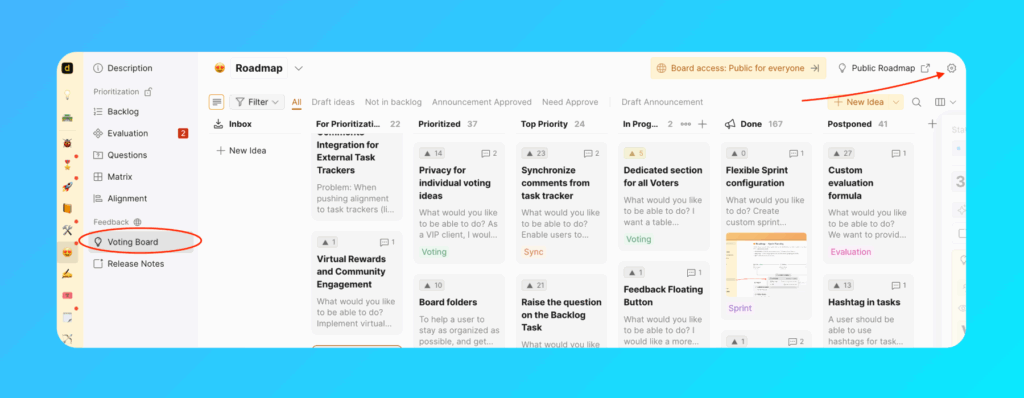
Find Embed section. Click on Add ‘What’s New’ Widget.
2. Install Base Widget Code
You need to add that code to the bottom of the pages you’d like to show the widget.
<!-- Ducalis.io Changelog Widget -->
<script>
  !function(b,c,f,d,a,e){b.dclsPxl||(((d=b.dclsPxl=function(){d.callMethod?d.callMethod.apply(d,arguments):d.queue.push(arguments)}).push=d).queue=[],(a=c.createElement("script")).async=!0,a.src=f,(e=c.getElementsByTagName("script")[0]).parentNode.insertBefore(a,e))}(window,document,"https://ducalis.io/js/widget.js")
  dclsPxl("initWidget", {
    appId: "_YOUR_APP_ID", // Required
    boardId: "_YOUR_BOARD_ID", // Required
  });
</script>
<!-- End Ducalis.io Changelog Widget -->
3. Create An Open Widget Button
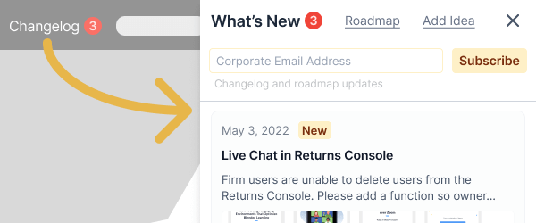
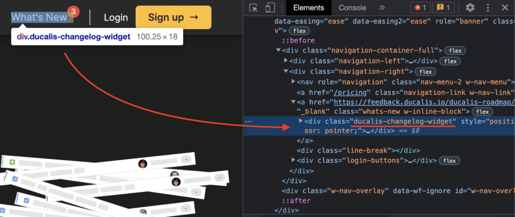
To create a button for opening widget and showing notifications, add a CSS class to any element:
<div class="ducalis-changelog-widget">What's new</div>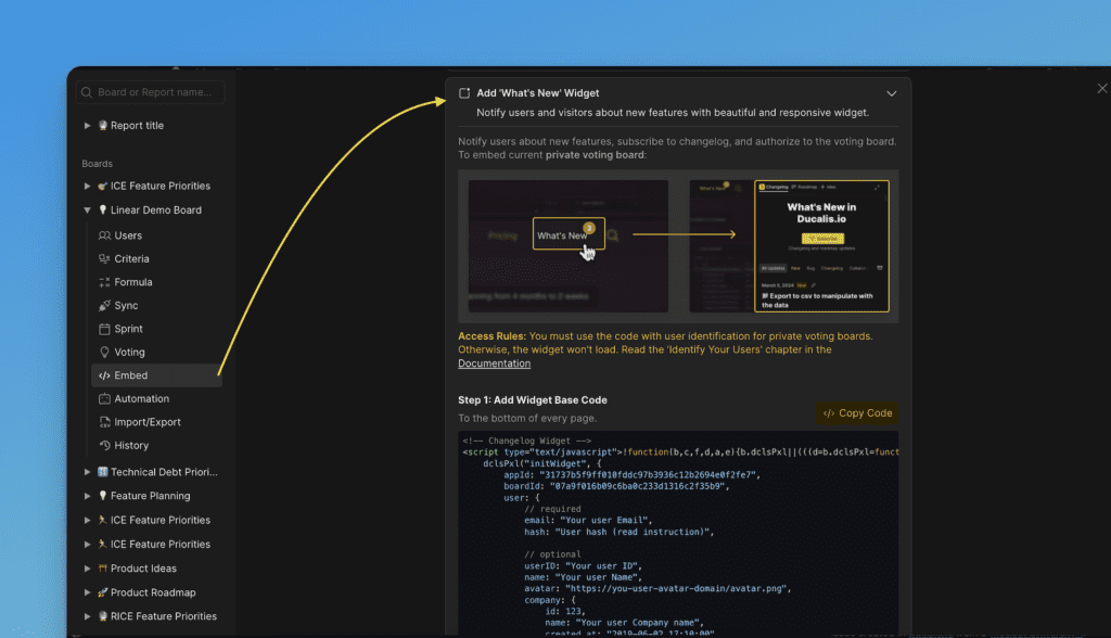
Here is an example from our landing page:
4. Widget Features in Base Configuration
That is enough to show changelog and attract your visitors’ attention to your new features.
- Show the widget with your latest voting board ideas in Done status sorted by the release date.
- Show notification for newly released features (ideas moved to done)
- Visitors can read up to 20 released ideas.
- Go to your voting board to check your roadmap, add new ideas, upvote, and comment.
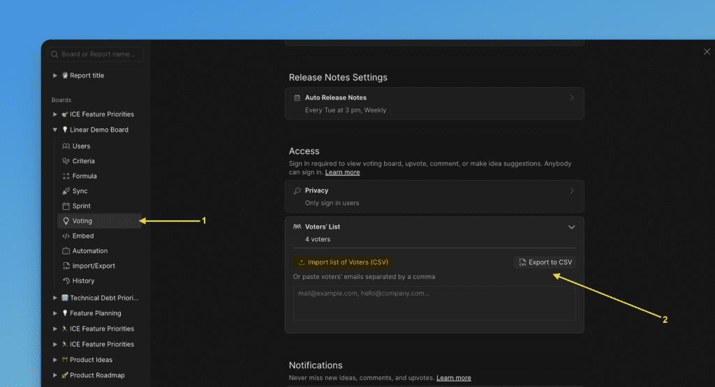
- Captures emails for sending your roadmap weekly digest updates.
- You can find your voting board subscribers under Voting board settings.
5. Specify which page you want to open in the Widget By Default
You can choose whether the Roadmap or Changelog page will be opened first in your Widget.
If you want to specify the page, you need to configure defaultView in the code. Choose whether you want the Roadmap or Changelog page to be opened; for example, defaultView: roadmap.
dclsPxl("initWidget", {
  ...
    // optional, default state is undefined
    // Use 'roadmap' or 'changelog' to open specific page
    defaultView: undefined,
  ...
});
Also, for the Changelog and Roadmap pages, you can optionally open a specific filter or action (only for authorized users).
dclsPxl("initWidget", {
   ...

   // optional,
   // use it to open a specific filter (only for authorized users)
   openNewIdea: true,
   myIdeas: true,
   myVotes: true,

   ...
});
6. Use Ducalis authorization or your own authorization method
1.By the default Ducalis autohization is used for your customers when they want to vote, add idea, comment on idea.
2. If you use your own authentication you should specify it in code onAuth: showUserAuth
dclsPxl("initWidget", {
    appId: "_YOUR_APP_ID", // Required
    boardId: "_YOUR_BOARD_ID", // Required
    ...
    onAuth: showUserAuth
    ...
});
If this function is specified, it will be called instead of Ducalis authentication, meaning the entire authentication process will be on the client (your) side, but you must then pass us the widget user who has authenticated: user.email + user.hash are required.
dclsPxl("initWidget", {
    // required
    appId: "dc9ae89*******",
    boardId: "78aef2c7c0********",

    user: {
        // required
        email: "Your user Email",
        hash: "User hash (read instruction)",
        ...
     },
     onAuth: showUserAuth
    ...
});
🎨 Customize Widget Look (~15 minutes)
After embedding the Ducalis Changelog Widget, you may want to customize it to match your product.
We have plenty of taking options. Just add the needed parameters to your code.
Example:
<script>
  !function(b,c,f,d,a,e){b.dclsPxl||(((d=b.dclsPxl=function(){d.callMethod?d.callMethod.apply(d,arguments):d.queue.push(arguments)}).push=d).queue=[],(a=c.createElement("script")).async=!0,a.src=f,(e=c.getElementsByTagName("script")[0]).parentNode.insertBefore(a,e))}(window,document,"https://ducalis.io/js/widget.js")
  dclsPxl("initWidget", {
    appId: "_YOUR_APP_ID", // Required
    boardId: "_YOUR_BOARD_ID", // Required
    selector: "_YOUR_SELECTOR", // optional - default .ducalis-changelog-widget
    width: "400", // optional, Widget width (minimal width 400px)
    debug: true, // optional - Always show Notification bubble and logs for events

    bubble: {
      selector: '#embedBoardBuble', // optional - use it for bubble without widget, default ".ducalis-changelog-widget"
      className: 'some-class-name', // optional - clear initial styles. Usage for custom styles by className ONLY. Default undefined
      style: { // optional, customization initial styles. Default undefined
	right: '7px',
	top: '7px',
	backgroundColor: '#db3737',
	borderRadius: '4px',
	fontSize: '13px',
       }
     },
   });
 </script>
If you’ve already embedded the widget before, use the new parameter
NOTE! Parameters top, right, backgroundColor, color are still working, but will be Deprecated and aren’t used. Use the parameter bubble.style instead.
You need to add the code with the new parameter bubble.style.
bubble: {
    ...
    // optional, default state is undefined
    // customization initial styles
    style: {
	right: '7px',
	top: '7px',
	backgroundColor: '#db3737',
	borderRadius: '4px',
	fontSize: '13px',
    }
    ...
}
Debug Widget Notification
debug: true,
Whenever you open a widget, it counts as if you read all updates, and the red bubble disappears. For better layout testing, use a debug mode.
You can close and open the widget at any time, and it will always show a red notification circle near the selected class. In addition, it can help you tweak the correct position.
Attach Notification Bubble to Any Element
selector: "_YOUR_SELECTOR"
Select or create an element to trigger the Ducalis widget. Use that element’s id or unique class for the selector parameter. (Important: If the selector is a class and not an id, you have to write it starting with a dot. e.g. for class openWidget, your selector would be .openWidget )
For your widget selector you can use:
- id:
#DucalisChangelogNotification,#someID, … - class:
.DucalisChangelogNotification,.someClass,.some-class, … - attribute
[data-bubble="1"],[data-whats-new], … - mix
div.someClass[data-show-bubble="true"],a[href^="<https://feedback.ducalis.io>"], …
Notification colors
Match colors of your product. These are default colors:
backgroundColor: "#f04438", // Notification bubble Background color
color: "#fee4e2", // Notification bubble text color
Notification Red Bubble Position
This is the default. It is positioned to the element you’ve attached to the selector.
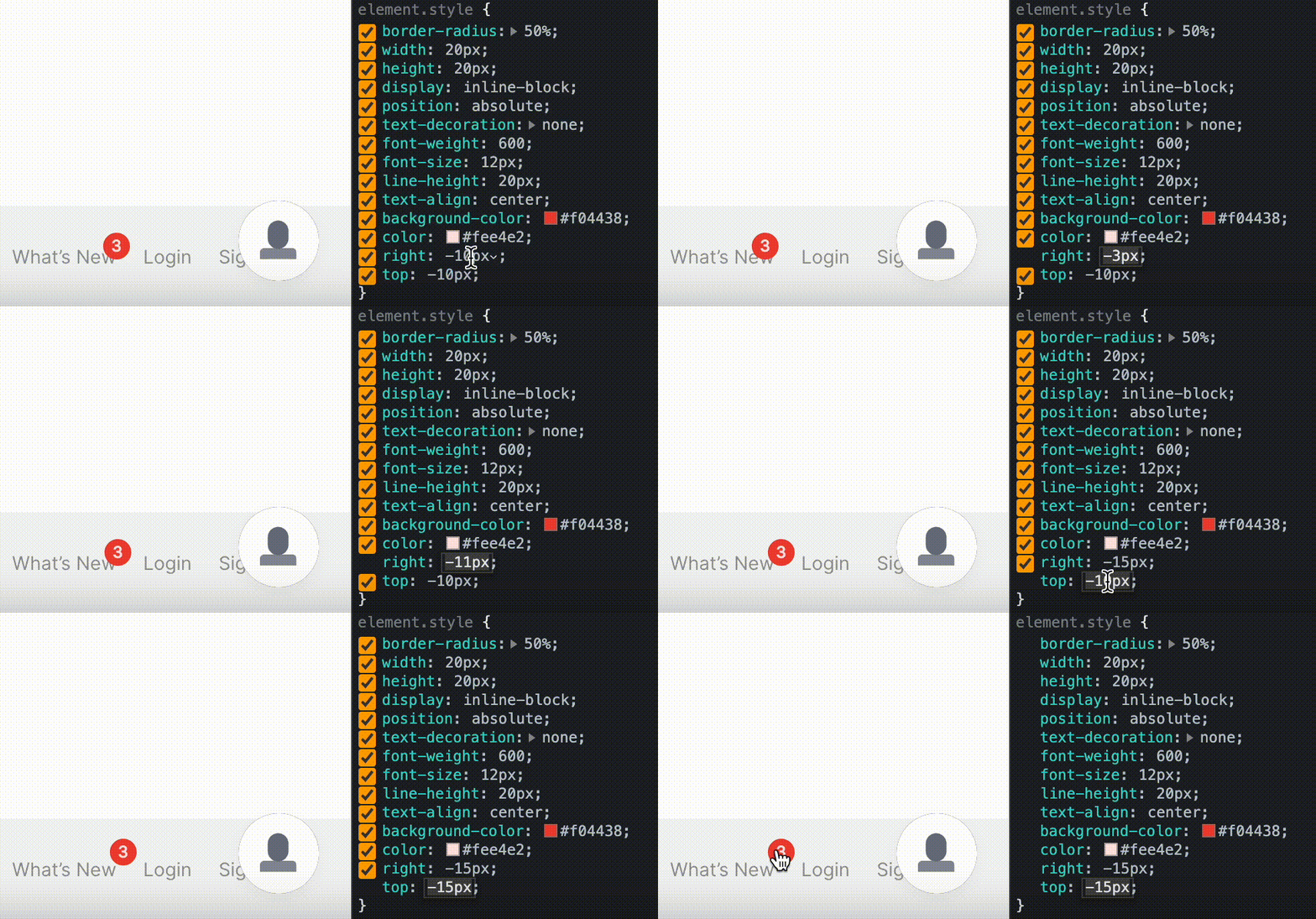
If you don’t like the notification bubble position: tweak it in the browser dev tool and add it to the widget settings.
top: "-10px", // Notification bubble position by top
right: "-10px", // Notification bubble position by right
Widget Width
By default widget width 376px you can change:
width: "376px", // optional, Widget width
Your additional custom CSS class
For advanced use only! Аdd’s custom class name to the notification bubble without styles from our side. You can customize the Notification bubble with your CSS.
bubble.className: "_SOME_CLASS_NAME"
bubble: {
    ...
    // optional - clear initial styles.
    // Usage for custom styles by className ONLY. Default undefined
    className: 'some-class-name',
    ...
}
NOTE! The parameters
bubbleClassNameis still working, but will beDeprecated. Use the parameterbubble.classNameinstead.
How to Subscribe Customers To Release Notes
One of the most useful features of voting boards is the automation of release notes.
Since the voting board is a separate application, and to avoid constantly importing lists of new active users of your product, the auto-subscription to release notes is enabled by default.
And there are following conditions to subscribe users automatically:
- you need to send users data to Ducalis via The Ducalis API or Widget (user.email + user.hash are required),
- user should open a widget or a board frame.
With these two completed conditions users will be subscribed to release notes automatically.
BUT! in order for those users to receive release notes updates, you need to set up a custom email domain. Please contact us to do it.
dclsPxl("initWidget", {
    // required
    appId: "dc9ae89*******",
    boardId: "78aef2c7c0********",

    user: {
        // required
        email: "Your user Email",
        hash: "User hash (read instruction)",
        ...
    },

     // Auto subscribe current user on current board (needed user.email + user.hash)
    autoSubscribe: true,  // optional, default: true
});
If you have the conditions above, but you don’t need to subscribe users automatically, just change to autoSubscribe: false.
